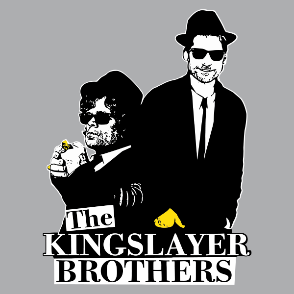
05/21/2014 Top Pick; Kingslayer Brothers
“Perhaps you should speak to me more softly then. Monsters are dangerous and, just now, kings are dying like flies.” I guess regicide runs in this family. The Lannister brothers look suave in their dark shades and black Blues Brothers attire. I very much enjoy the monotone design with a few bright yellow areas that pop and add contrast. Their golden additions (Jaime’s hand, Tyrion’s rings) also help lead the eye from their stylized faces to the bold, bottom text. I really enjoy the collage feel of the design. The faces of the actors, their suits, accessories, and even how they are posed together look pieced or cut out and pasted together. This is also translated to the text, where some is contained within a cut out white box.
Thank You Jonah Lynch
Buy This Shirt! Kingslayer Brothers

05/21/2014 Top Pick; The Shadow on The Moon
Tim Burton meets Steven Spielberg in this delightful mash-up. Come out boys and girls of every age and see something strange in the town of Halloween! This is Halloween, this is Halloween! Jack magically flies with his good pal Zero in front of a huge glowing moon. I am really drawn to the enlarged moon. It is bright, round, and placed dead center acting like a bullseye for the design. Jack and Zero are nicely contained within the large nicely textured moon giving them full attention. The scene below is calm, evenly textured, and simple so as to leave the attention on the characters within the moon. I really enjoy the details of the bicycle. The spider web spokes of the wheels and the pumpkin basket are finely rendered. If Jack rode a bicycle this is definitely the one he would ride.
Thank You Wirdou
Buy This Shirt! The Shadow on The Moon

05/21/2014 Top Pick; Daikaiju
Wooooow! This was my exact reaction during this scene in the movie. We see something light up bright blue, then rapidly the light trails upward and blasts out of Godzilla’s mouth! This was probably my favorite part of the film! This design nicely portrays this event. The bright blue blast was jaw dropping! (especially for the giant Muto!). It’s okay, most people don’t laugh at my jokes! Godzilla’s upward radioactive fire-breathing pose is epic and well rendered. I enjoy how the artist added the blue gradation on the monster’s body giving it texture and also helps show how the blast builds up from within and erupts upward. The large and bold block glyphs fit nicely with this large bold giant. The glyphs also seem to resemble the large broken down building in the midst of the destruction. Love it!
Thank You InkOne
Buy This Shirt! Daikaiju
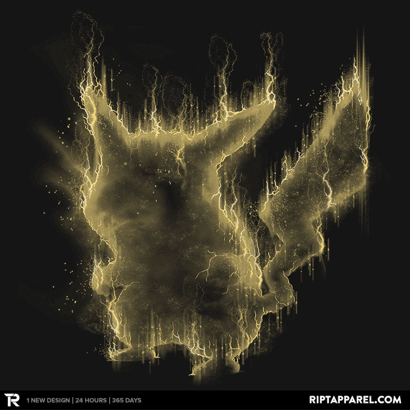
05/21/2014 Top Pick; Electric Type
PIKA!!! This design is electrifyingly (yes, I made that word up) awesome! Pikachu is glowing as he powers up for an attack! The cloudy yellow color bellows within the body creating a wonderful texture while setting a nice backdrop for the brighter thin bolts. The bright bolts make up most of the outline which gives Pikachu a radiating electric static appearance. While this design looks simple in a monotone yellow on black, the textures make this design positively explosive!
Thank You StevenLefcourt
Buy This Shirt! Electric Type
HELP SAVE ZERO


