05/14/14 Top 3 Pick: First Shot
ATTITUDE! Both Han and Rocket are a shoot first ask questions later kind of guys. Rendered here in a tough, “cool guy” slouch, Rocket looks relaxed and nonchalant. Of course, hidden below this calm demeanor is his pistol pointed straight at its victim. I love his well illustrated raccoon face and his highly expressive eyes. The bold blocks and rough outlines of the letter forms justly fit the tough guy persona of both characters. I also really enjoy how the bright yellow of the fire really stands out against the earth tones of this design. And yes George Lucas, Han shot first!
Thank You CS3INK
Buy This Shirt! First Shot

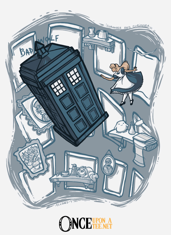
05/14/14 Top 3 Pick: The TARDIS Zone
Surprise! I picked a Dr. Who shirt! Weird huh!? Tah dah, tah dah, tah dah, tah dah (that was my best onomatopoeia of the show’s intro music). I really enjoy this clever mash-up. Exploring space and time, the Tardis could definitely be in an episode of the Twilight Zone. Nice, simple outline of the tardis floating through space. Wonderful translation of the letter forms including: the odd-shaped serifs, various baselines, x-heights, and shifting letter axis. As you guys know, I am a sucker for typography and black and white designs!
Thank You Drew Wise
Buy This Shirt! The TARDIS Zone

05/14/14 Top 3 Pick: It’s Hip To Be Square
It is hip to be square, in a pixellated digital world! I love the angle in which this design is presented. It works great for the little 3-d objects and block letter forms. All the little objects seem to shift planes which make them appear in motion. Having the design be in simple black, white, and bright magenta definitely helps give it a digital appearance.
Thank You Manos
Buy This Shirt! It’s Hip To Be Square


“Touch Darkness”
Awesome ZEROBRIANT shirt available this week at Zebra Tees!
Also Design By Humans is matching Zerobriant Designs Fan Page‘s royalties for the remainder of May to raise money for his surgery.
Help keep this awesome artist designing by checking out his DBH Store here – http://bit.ly/ZeroBriantFB
 Composition – Beautifully balanced composition. The left and right side are not exact mirror images but are very similar and nicely balanced in color and form.