Design review and links. Stars  out of 5.
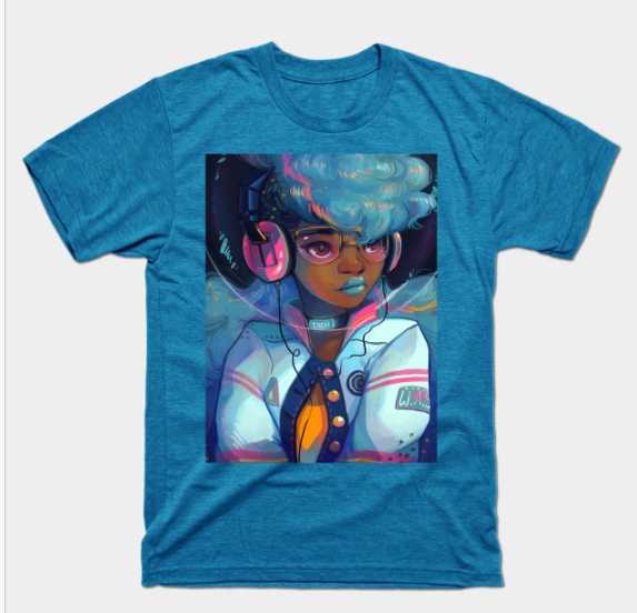
01.06.2017 | Space Letterman
Excellent Color! It’s not usual to see original art printed at daily shirt sites. So excited to see this Astrohot girl.
Render –
Color –
Thank you, GDBee!

Design review and links. Stars out of 5.
01.06.2017 | Space Letterman
Excellent Color! It’s not usual to see original art printed at daily shirt sites. So excited to see this Astrohot girl.
Render –
Color –
Thank you, GDBee!

It’s a Snow Day here in VA! The ground is covered in nice white powder. Time to blog! What better way to spend the time indoors? Luckily there are two designs today that captured my interest 🙂
 1
1
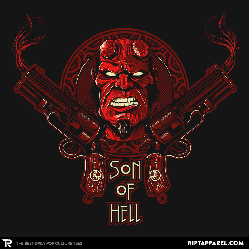
2/17/15 Top Pick; Son Of Hell
![]() Composition – Nice simple bilateral symmetry. The round plate in the background nicely unites the two smoking guns in the foreground.
Composition – Nice simple bilateral symmetry. The round plate in the background nicely unites the two smoking guns in the foreground.
![]() Color – I really enjoy the monochromatic reds with the limited cream color highlights.
Color – I really enjoy the monochromatic reds with the limited cream color highlights.
![]() Lines & Forms – Wonderful lines and forms in the details of the guns. I also really enjoy the geometry in the round plate. Hellboy’s face looks rough and is nicely highlighted by the thin brighter red lines.
Lines & Forms – Wonderful lines and forms in the details of the guns. I also really enjoy the geometry in the round plate. Hellboy’s face looks rough and is nicely highlighted by the thin brighter red lines.
Thank You Fernando Sala
Buy this Shirt! Son Of Hell
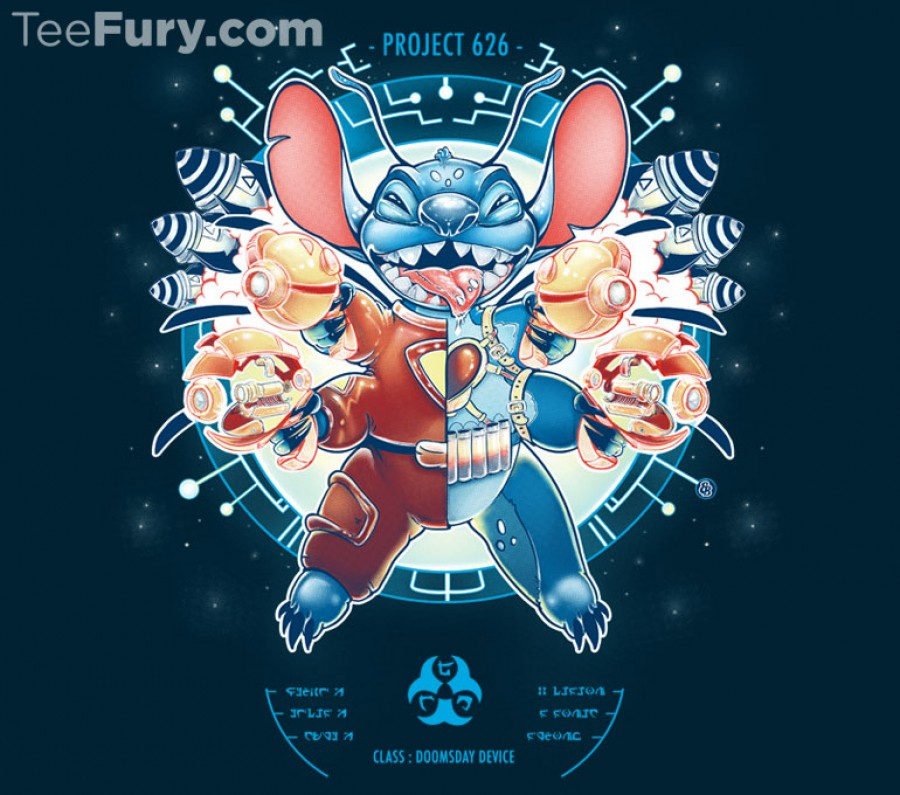
2/17/15 Top Pick; Project 626
![]() Composition – Awesome radial symmetry. The many limbs and weapons nicely balance around the center. I really enjoy the light blue icon and text on the bottom of the design. It pulls the eye downward, stabilizes, and completes the design.
Composition – Awesome radial symmetry. The many limbs and weapons nicely balance around the center. I really enjoy the light blue icon and text on the bottom of the design. It pulls the eye downward, stabilizes, and completes the design.
![]() Color – Nice mix of warm and cool colors. I especially like the glow added around the entire design. For example, the light reflecting from Stitch’s nose, weapons, and even background.
Color – Nice mix of warm and cool colors. I especially like the glow added around the entire design. For example, the light reflecting from Stitch’s nose, weapons, and even background.
![]() Lines & Forms – Clean line work. I really like the dark and light outline around Stitch. It makes him glow and stand out from the busy round background.
Lines & Forms – Clean line work. I really like the dark and light outline around Stitch. It makes him glow and stand out from the busy round background.
Thank You Emilie B
She is one of my favs! Make sure to follow/like her on Facebook. She aways has awesome stuff on her page!
Buy this Shirt! Project 626


1/21/15 Top Pick; Dark City
![]() Composition – Wonderful play with positive and negative space. Like most of Kharmazero’s designs, it is composed of simple dark or negative space against a wash of exciting color as the positive space. I love that this designer is not afraid of stark contrast and he utilizes it wonderfully.
Composition – Wonderful play with positive and negative space. Like most of Kharmazero’s designs, it is composed of simple dark or negative space against a wash of exciting color as the positive space. I love that this designer is not afraid of stark contrast and he utilizes it wonderfully.
![]() Color – The contrasting light and dark colors nicely develop the design. The radiating reds, yellows, and oranges create an attractive field for the dark city landscape.
Color – The contrasting light and dark colors nicely develop the design. The radiating reds, yellows, and oranges create an attractive field for the dark city landscape.
Thank You Kharmazero
Buy This Shirt! Dark City

1/21/15 Top Pick; Never Say Die
![]() Lines & Forms – What a beauty! This designer’s female figures are breathtakingly gorgeous with an easily recognizable style. I love the thick wavy strips of hair. His typical big eyed beauties never fail to impress. I absolutely love the thick outlines and waving banners giving his designs a tattoo style appearance. As a part-time body piercer at a tattoo shop, I encounter this style on a regular basis. His lines, drawings, and sketches, which he frequently shares on Facebook, are just a beautiful!
Lines & Forms – What a beauty! This designer’s female figures are breathtakingly gorgeous with an easily recognizable style. I love the thick wavy strips of hair. His typical big eyed beauties never fail to impress. I absolutely love the thick outlines and waving banners giving his designs a tattoo style appearance. As a part-time body piercer at a tattoo shop, I encounter this style on a regular basis. His lines, drawings, and sketches, which he frequently shares on Facebook, are just a beautiful!
![]() Color – The wonderful shading technique nicely develops the forms and thus very little color is necessary.
Color – The wonderful shading technique nicely develops the forms and thus very little color is necessary.
Thank You Tim Shumate
Buy This Shirt! Never Say Die

11/19/14 Top Pick; Relativity
Interstellar was just a wonderful and amazing experience. A must watch on the big screen. So, if you haven’t watched this movie yet (what’s wrong with you!?) go head, get in your car, drive to the theater, and prepare to be delighted for the next 3 hours. Side note, if you cry during movies bring a box of tissues or two. Trust me!
![]() Color – I love the rich earth tones used in this design. Not only do they reflect the maze of books in the movie, but also Earth and humanity.
Color – I love the rich earth tones used in this design. Not only do they reflect the maze of books in the movie, but also Earth and humanity.
![]() Composition – Balanced bilateral symmetry that gives the erratic lines stability.
Composition – Balanced bilateral symmetry that gives the erratic lines stability.
![]() Lines and forms – I really enjoy the simple geometry forms that make up the center part of the design. They fall nicely creating an interesting positive space in the field above the helmet. Then they run down to develop the round shape of the helmet. The lines continue down to form interesting drips that mimic the top creating repetition.
Lines and forms – I really enjoy the simple geometry forms that make up the center part of the design. They fall nicely creating an interesting positive space in the field above the helmet. Then they run down to develop the round shape of the helmet. The lines continue down to form interesting drips that mimic the top creating repetition.
I’d also like to give a shout out for depicting Matthew McConaughey so well using simple blocks of color. Kudos!
Thank You DannyHaas
Buy This Shirt! Relativity

05/06/14 Top 3 Pick; The Dark Knightmare
This hypnotizing, maniacal grin is share by both The Joker and Oogie Boogie. Batman replaces Jack Skellington, standing tall over the scene. Batman’s wind-blown cape creates interesting wild shapes also mimicked throughout Joker’s crazed appearance. The city scape along with the “HA” signs create wonderful visual complexity and keep the eye jumping around the design. The lighter long stokes in the background along with the lighter figures in the teeth nicely break up the solid yellow plains keeping the design active. The Batman logo background also mimics the pumpkin shape of The Pumpkin King, Jack.
Thank You Donnie
Buy This Shirt! The Dark Knightmare
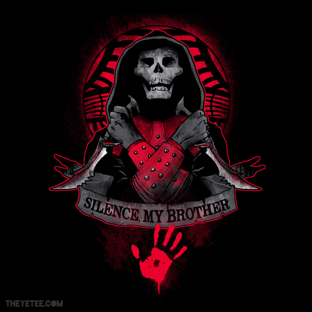
05/06/14 Top 3 Pick; Silence, My Brother
This Dark Brotherhood sign would nicely mark the underground settlement in Skyrim. Wonderful, well-balanced composition with bilateral symmetry. I enjoy how the crossed arms create an arrow which points to the red hand print. The thick red outline really makes the design pop and serves as a nice clean trim around the design. The skeletal figure is mostly made up of soft grays, except for the white on the blades, giving them a highlight and a shine.
Thank You Hilary White
Buy This Shirt! Silence, My Brother
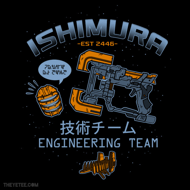
05/06/14 Top 3 Pick; Ishimura Engineering
Only class 5 engineers may sport this design. This interstellar mining ship is portrayed small in the lower center. The name of the ship is in a large, bold font on a curve in the top center. Together, they anchor and contain the other components in the design as they seem to float in space. Isaac’s plasma cutter tool dominates the center of the design, a makeshift weapon for dismembering Necromorphs. This calm and simple design hides the gruesome and hideous nature of Dead Space. A subtle shirt that non-gamers would never look at twice.
Thank You Amanda Flagg
Buy This Shirt! Ishimura Engineering
